Program Microsoft Excel offers the opportunity not only to work with numerical data, but also provides tools for building charts based on input parameters. At the same time, their visual display can be completely different. Let's see how to draw different types of charts using Microsoft Excel.
The construction of various types of diagrams is practically the same. Only at a certain stage you need to choose the appropriate type of visualization.
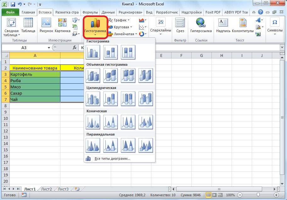
Before you start creating any chart, you need to build a table with data on the basis of which it will be built. Then, go to the "Insert" tab, and select the area of \u200b\u200bthis table, which will be expressed in the diagram.

On the ribbon in the "Insert" tab, select one of the six types of basic charts:
- Bar chart;
- Schedule;
- Circular;
- Ruled;
- With areas;
- Spot.

In addition, by clicking on the "Other" button, you can select less common types of charts: stock, surface, donut, bubble, spade.

After that, by clicking on any of the diagram types, it is proposed to select a specific subtype. For example, for a histogram, or a column chart, such subviews will be the following elements: regular histogram, volumetric, cylindrical, conical, pyramidal.
After selecting a specific subspecies, a diagram is automatically generated. For example, a typical histogram would look like the image below.

The diagram in the form of a graph will look like this.

The area chart will look like this.

Working with charts
After the chart is created, in the new tab "Chart Tools" become available additional tools to edit and modify it. You can change the chart type, style, and many other options.

The Chart Tools tab has three additional subtabs: Design, Layout, and Format.
In order to name the diagram, go to the "Layout" tab, and select one of the options for naming the name: in the center or above the diagram.

After this is done, the standard inscription "Chart Name" appears. We change it to any inscription that fits the context of this table.

The names of the chart axes are signed according to exactly the same principle, but for this you need to click the "Axis Names" button.

Chart display as a percentage
In order to display the percentage of various indicators, it is best to build a pie chart.
In the same way as we did above, we build a table, and then select the desired section of it. Next, go to the "Insert" tab, select the pie chart on the ribbon, and then, in the list that appears, click on any type of pie chart.


The pie chart with percentage data is ready.

Building a Pareto Chart
According to the theory of Vilfredo Pareto, 20% of the most effective actions bring 80% of the total result. Accordingly, the remaining 80% of the total set of actions that are ineffective bring only 20% of the result. The construction of the Pareto chart is just designed to calculate the most effective actions that give the maximum return. We will do this using Microsoft Excel.
It is most convenient to build a Pareto chart in the form of a histogram, which we have already discussed above.
Construction example. The table provides a list of food items. In one column, the purchase price of the entire volume of a particular type of product in the wholesale warehouse is entered, and in the second - the profit from its sale. We have to determine which products give the greatest “return” when sold.
First of all, we build a regular histogram. Go to the "Insert" tab, select the entire range of the table, click the "Histogram" button, and select desired type histograms.

As you can see, as a result of these actions, a chart was formed with two types of columns: blue and red.
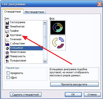
Now, we need to convert the red bars into a graph. To do this, select these columns with the cursor, and in the "Designer" tab, click on the "Change Chart Type" button.

The Change Chart Type window opens. Go to the "Chart" section and select the type of chart that suits our purposes.

So, the Pareto chart is built. Now, you can edit its elements (chart and axes title, styles, etc.), just as it was described in the example of a bar chart.

As we see, Microsoft program Excel introduces a wide range of tools for building and editing various types diagrams. In general, working with these tools is maximally simplified by developers so that users with different levels of experience can cope with them.
If you need to visualize data that is difficult to understand, then a chart can help you with this. Using a chart, you can easily show relationships between different indicators, as well as identify patterns and sequences in your data.
You may think that you need to use difficult-to-learn programs to create a diagram, but this is not so. To do this, you will need a regular text editor Word. And in this article we will demonstrate it. Here you can learn about how to make a chart in Word 2003, 2007, 2010, 2013 and 2016.
How to make a chart in Word 2007, 2010, 2013 or 2016
If you are using Word program 2007, 2010, 2013 or 2016, to make the chart you need you need to go to the "Insert" tab and click on the "Chart" button there.
After that, the "Insert Chart" window will appear in front of you. In this window you need to select the appearance of the chart that you want to insert into your Word document and click on the "Ok" button. Let's take a pie chart as an example.

After you choose the appearance of the chart, in your Word document an example of what your chart of choice might look like will appear. This will immediately open a window. Excel programs. In Excel, you will see a small table with data that is used to build a chart in Word.

In order to modify the inserted diagram to suit your needs, you need to make changes to the table in Excel. To do this, simply enter your own column names and the necessary data. If you need to increase or decrease the number of rows in the table, then this can be done by changing the area highlighted in blue.

After all the necessary data is entered into the table, Excel can be closed. After closing the Excel program, you will receive the chart you need in Word.

If in the future it becomes necessary to change the data used to build the chart, then for this you need to select the diagram, go to the "Design" tab and click on the "Edit data" button.

Use the Design, Layout, and Format tabs to customize the appearance of the chart. Using the tools on these tabs, you can change chart color, labels, text wrapping, and more.
How to make a pie chart in Word 2003
If you are using text editor Word 2003, then to make a chart you need you need to open the "Insert" menu and select the item "Picture - Chart" there.

As a result, a chart and a table will appear in your Word document.

To make a pie chart click right click mouse over the chart and select the "Chart Type" menu item.

After that, a window will appear in which you can select the appropriate type of chart. Among other things, here you can select a pie chart.
After saving the settings appearance chart, you can begin to change the data in the table. Double click the left mouse button on the diagram and a table will appear in front of you.

Using this table, you can change the data that is used to build the chart.
Pie charts- one of the types of area diagrams that are easy to understand. They show parts of the total and are useful tool when analyzing surveys, statistics, complex data, income or expenses. Such diagrams are very informative - the audience can see what is happening. Use pie charts to make a great presentation of school and work projects.
Steps
Building a pie chart
- build a pie chart 1 Calculate the pie chart (its proportions).
- build a pie chart 2 Gather the numbers and write them down in a column in descending order.
- build a pie chart 3 Find the total sum of all the values (just add them up for this).
- build a pie chart 4 For each value, calculate its percentage of the total; to do this, divide each value by the total amount.
- build a pie chart 5 Calculate the angle between the two sides of each sector of the pie chart. To do this, multiply each percentage found (as a decimal fraction) by 360.
- The logic of the process is that there are 360 degrees in a circle. If you know that the number 14400 is 30% (0.3) of the total, then you calculate 30% of 360: 0.3*360=108.
- Check your calculations. Add up the calculated angles (in degrees) for each value. The sum should equal 360. If this is not the case, then a mistake has been made and everything must be recalculated.
- build a pie chart 6 Use a compass to draw a circle. To draw a pie chart, you need to start with a perfect circle. This can be done with a compass (and a protractor for measuring angles). If you don't have a compass, try using any round object like a lid or a CD.
- build a pie chart 7 Draw a radius. Start at the center of the circle (the point where you placed the compass needle) and draw a straight line to any point on the circle.
- A straight line can be vertical (connecting 12 and 6 o'clock on the dial) or horizontal (connecting 9 and 3 o'clock on the dial). Create segments by moving sequentially clockwise or counterclockwise.
- build a pie chart 8 Lay the protractor on the circle. Place it on the circles so that the center of the protractor ruler coincides with the center of the circle, and the mark of 0 degrees coincides with the radius drawn above.
- build a pie chart 9 Draw segments. Draw the segments using the protractor, setting aside the angles calculated in the previous steps. Each time you add a segment (draw a new radius), rotate the protractor accordingly.
- When applying corner marks, make sure they are clearly visible.
- build a pie chart 10 Color each segment. you can use different colors, linetypes, or just words (symbols) depending on what suits your purposes best. Add a title and percentage for each segment.
- Color each segment of the pie chart in a specific color for easy viewing of the results.
- If you are drawing a diagram with a pencil, trace the outlines of the diagram with a pen or felt-tip pen before coloring the diagram.
- The names and numbers in each segment should be written horizontally and centered (the same distance from the edge for each segment). This makes them easier to read.
- Double check that all angles are accurate.
- Remember that everything good graphics have titles and signatures.
- Check the calculations carefully, because if they are wrong, then you will get the wrong graph.
- More complex forms of a pie chart include highlighting a segment by deleting it, or constructing a sliced chart, where each segment is shown separately from the other. This can be done manually or with a computer program.
- If you don't have a very good compass, it's easier to draw a circle by holding the compass and rotating the paper.
- Objects such as coins or flags can be turned into pie charts (for visual appeal).
- Make sure that the sum of the percentages found is equal to 100%.
- After gaining the skills to build such charts, you can shift the perspective of the pie chart, turning it into a 3D or layered chart. These are more advanced forms of the pie chart and require more detailed work and knowledge.
Warnings
- Always check your work to make sure your calculations are correct.
What will you need
- Compasses (or round object)
- Protractor
- Pencil and paper
- Eraser
- Markers or colored pencils
The human mind is designed in such a way that it is easier for it to perceive visual objects, otherwise they have to be represented. It is this fact that has led to the widespread use of diagrams. To create them, you do not need to install separate programs, just remember excel.
The process of creating a diagram
First of all, you will need to enter the initial data, most users try to create it on blank sheet, which is an error. The table should consist of two columns, in the first it is necessary to place the names, and in the second the data.
Next, you need to select the table along with the names of the columns and columns, and then go to the "Insert" tab, selecting the "Charts" item there. Several options will be offered, 4 types are available in the “Circular” menu: the last two are used for complex data sets in which some indicators depend on others, for simple tables use the first and second diagrams, they differ only in the presence of cuts. After clicking on the icon, a diagram will appear.
Change data and appearance
For a successful presentation of the material, it is not enough to know only how to build a pie chart inexcel, often it is necessary to edit it at your discretion. There is a special menu for this, which will become active after clicking on the diagram. There you can give it a different shape or save the current settings as a template if you need to create many similar ones.
Also, the color is configured here, for this you should select the desired style in the corresponding menu. To insert labels, you need to go to the “Layout” tab, the “Signatures” menu is located there, you need to select the “Data Labels” item, an additional window will appear.

To edit the inscriptions, you need to click on one of them and select the “Format of signatures” item. In a special window, you can customize their color, background, location, and content, for example, activate relative data instead of absolute data.

Of course, these are not all possible settings, but for most users they are enough to build a pie chartexcel.
Pie charts- represent a circle divided into sectors (cake), and are used to show the relative value that makes up a single whole. The largest sector of the circle should be first clockwise from the top. Each sector of the circle must be marked (required name, value and percentage). If it is necessary to focus on a particular sector, it is separated from the rest.
The pie chart type is useful when you want to display the share of each value in the total.
Let's build a three-dimensional pie chart that displays the production load during the year.
Rice. Data for plotting charts.
With a pie chart, only one data series can be displayed, each element of which corresponds to a certain sector of the circle. The area of the sector as a percentage of the area of the entire circle is equal to the share of the row element in the sum of all elements. Thus, the sum of all shares by season is 100%. The pie chart created from this data is shown in the figure:

Rice. Pie chart.
There are 6 types of pie charts in Excel:
Rice. Types of pie chart.
circular - displays the contribution of each value to the total;
volume circular;
secondary circular - part of the values of the main diagram is placed on the second diagram;
cut circular - sectors of values are separated from each other;
volume cut circular;
secondary histogram - part of the values of the main diagram is placed in the histogram.
If you want to separate slices in a pie chart, you don't have to change the chart type. It is enough to select the circle and drag any sector in the direction from the center. To return the original view of the chart, drag the sector in the opposite direction.

Rice.
It should be remembered that if you want to separate only one sector, you should make two single clicks on it. The first will highlight the data series, the second - the specified sector.

Rice. Changing the appearance of a pie chart.
In a pie chart, sectors can be rotated 360 around the circle. To do this, select the tab on the ribbon. Layout and paragraph Selection Format.
A secondary pie chart, like a secondary bar chart, allows some of the data to be displayed separately, in more detail, on an auxiliary chart or histogram. Moreover, the secondary diagram is taken into account on the primary diagram as a separate share. As an example, consider a chart showing weekly sales, with the weekend portion plotted as a secondary pie chart. When choosing a chart type, specify Secondary circular.


Rice. secondary chart.
Data that is arranged in columns and rows can be displayed as a scatter plot. A scatter plot shows relationships between numerical values in multiple data series, or displays two groups of numbers as a single series of x and y coordinates.
scatter plot has two value axes, with some numeric values displayed along the horizontal axis (X-axis) and others along the vertical axis (Y-axis). In a scatter plot, these values are combined into a single dot and plotted at irregular intervals or clusters. Scatter plots are commonly used to illustrate and compare numerical values, such as scientific, statistical, or technical data.