To begin with, this article was written with the aim of explaining how to create an image scrolling slider for web pages. This article is in no way educational in nature, it only serves as an example of how our object of consideration can be implemented. You can use the code provided in this article as a template for such developments, I hope that I will be able to convey to the reader in sufficient detail and in an accessible way the whole essence of what I have written.
And now to the point, not so long ago I needed to put a slider on one site, but when I searched the Internet for ready-made scripts, I did not find anything worthwhile, because. some did not work as I needed, while others did not start at all without errors in the console. Use jQuery plugins for a slider, it seemed to me too uninteresting, because. Although I will solve the problem with this, I will not have any understanding of the operation of this mechanism, and using the plugin for the sake of one slider is not very optimal. I also didn’t really want to understand crooked scripts, so I decided to write my own script for the slider, which I myself will mark up as I need.
To begin with, we need to decide on the logic of the slider itself, and then proceed with the implementation, at this stage it is very important to have a clear understanding of the operation of this mechanism, because without it we cannot write code that works exactly the way we want.
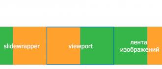
Our main object will be viewport, that is, the block in which we will see how our pictures are spinning, in it we will have slide wrapper, this will be our block containing all the images lined up in one line, and which will change its position inside the viewport.
Further, on the sides inside viewport, vertically in the middle, there will be back and forth buttons, when clicked, we will also change the position of our slide wrapper relatively viewport, thereby causing the effect of scrolling pictures. And finally, the last object will be our navigation buttons, located at the bottom viewport.
When clicking on them, we will simply look at the serial number of this button and move to the slide we need again by shifting slide wrapper(the shift will be made through a change transform css properties, the value of which will be constantly calculated).
I think the logic of this whole thing should be clear after what I have said above, but if there are still misunderstandings somewhere, then everything will be cleared up in the code, you just need a little patience.
Now let's write! First, let's open our index file and write the markup we need there:


As you can see, nothing complicated block-for-slider serves as just the same block in which our slider will be placed, inside it is already viewport, which contains our slide wrapper, aka nested list, here li are slides and img- pictures inside them. Please pay attention to the fact that all images must be of the same size or at least proportions, otherwise the slider will look crooked. its dimensions directly depend on the proportions of the image.
Now we need to stylize the whole thing, usually styles are not particularly commented on, but I decided to focus on this, so that there would be no misunderstanding in the future.
body ( margin: 0; padding: 0; ) #block-for-slider ( width: 800px; margin: 0 auto; margin-top: 100px; ) #viewport ( width: 100%; display: table; position: relative; overflow: hidden; -webkit-user-select: none; -moz-user-select: none; -ms-user-select: none; -o-user-select: none; user-select: none; ) #slidewrapper ( position: relative; width: calc(100% * 4); top: 0; left: 0; margin: 0; padding: 0; -webkit-transition: 1s; -o-transition: 1s; transition: 1s; -webkit -transition-timing-function: ease-in-out; -o-transition-timing-function: ease-in-out; transition-timing-function: ease-in-out; ) #slidewrapper ul, #slidewrapper li ( margin : 0; padding: 0; ) #slidewrapper li ( width: calc(100%/4); list-style: none; display: inline; float: left; ) .slide-img ( width: 100%; )
Let's start with block-for-slider, I repeat, this is our block on the page, which we will assign under the slider, its height will depend on its width and on the proportions of our image, because viewport occupies the entire width block-for-slider, then himself slide has the same width, and, accordingly, the picture inside it changes its height depending on the width (proportions are preserved). I placed this element on my page horizontally in the middle, 100px indented from above, making its position more convenient for the example.
Element viewport, as already mentioned, occupies the entire width of our block-for-slider, it has the property overflow:hidden, it will allow us to hide our image feed that goes beyond the viewport. 
Following css property - user-select:none, allows you to get rid of the blue highlighting of individual elements of the slider with multiple clicks on the buttons.
Let's move on to slide wrapper why position:relative, but not absolute? Everything is very simple, because. if we choose the second option, then with the property viewport overflow:hidden nothing will seem to us, tk. myself viewport will not adjust to height slide wrapper, due to which it will have height:0. Why does the width matter and why do we set it at all? The point is that our slides will have a width equal to 100% of viewport, and to arrange them in a line, we need a place where they will stand, so the width slide wrapper should equal 100% viewport width multiplied by the number of slides (4 in my case). Concerning transition and transition-timing-function, then here 1s means that change of position slide wrapper will occur within 1 second and we will observe it, and ease-in-out- a type of animation in which it goes slowly at first, accelerates to the middle, and then slows down again, here you can already set the values \u200b\u200bin your own.
The next block of properties sets slide wrapper and its child elements are zero-padded, comments are superfluous here.
Next, we will style our slides, their width should be equal to the width viewport, but because they are in slide wrapper, whose width is equal to the width of the viewport multiplied by the number of slides, then to get the width viewport again, we need 100% of the width slide wrapper divide by the number of slides (in my case, again, by 4). After we turn them into inline elements with display:inline and set the wrap to the left by adding the property float:left. Pro list-style:none I can say that I use it to remove the default marker from li, in most cases is a kind of standard.
So slide-img it's simple, the image will take up the entire width slide, slide adjust to its height slide wrapper adjust to height slide, and the height viewport in turn will take the value of the height slide wrapper, thus the height of our slider will depend on the proportions of the image and the size of the block provided for the slider, which I already wrote about above.
I think we figured out the styles on this, for now we will do a simple slide show without buttons, and after we make sure that it works properly, we will add and style them.
Let's open our js file, which will contain the slider code, do not forget to include jQuery, because we will write using this framework. By the way, at the time of this writing, I use the version jQuery 3.1.0. The file itself with the script must be included at the very end of the tag body, because we'll be working with DOM elements that need to be initialized first.
For now, we need to declare a couple of variables, one will store the number of the slide that we see at a certain point in time during viewport I called her slideNow, and the second will store the number of these very slides, this slideCount.
var slideNow = 1; var slideCount = $("#slidewrapper").children().length);
variable slideNow it is necessary to set the initial value to 1, because when the page loads, based on our markup, we will see the first slide in viewport.
V slideCount we will put the number of children slide wrapper, everything is logical here.
Next, you need to create a function that will be responsible for switching slides from right to left, let's declare it:
function nextSlide() ( )
We will call it in the main block of our code, which we will get to, but for now we will tell our function what it needs to do:
function nextSlide() ( if (slideNow == slideCount || slideNow<= 0 || slideNow >slideCount) ( $("#slidewrapper").css("transform", "translate(0, 0)"); slideNow = 1; ) else ( translateWidth = -$("#viewport").width() * ( slideNow); $("#slidewrapper").css(( "transform": "translate(" + translateWidth + "px, 0)", "-webkit-transform": "translate(" + translateWidth + "px, 0 )", "-ms-transform": "translate(" + translateWidth + "px, 0)", )); slideNow++; ) )
First, we check if we are currently on the last slide of our feed? To do this, we take the number of all our slides using $("#slidewrapper").children().length and compare it with the number of our slide, if they are equal, then this means that we need to start showing the tape again, from 1 slide, which means we change transform css property at slide wrapper on the translate(0, 0), thus shifting it to its original position so that the first slide is in our field of view, let's also not forget about --webkit and --ms for adequate cross-browser display (see css property reference). After that, do not forget to update the value of the variable slideNow, informing her that slide number 1 is in view: slideNow = 1;
The same condition includes checking that the number of the slide that we see is within the number of our slides, but if somehow this is not done, then we will return to the 1st slide again.
If the first condition is not met, then this means that we are currently neither on the last slide, nor on some non-existent one, which means we need to switch to the next one, we will do this by shifting slide wrapper left by a value equal to the width viewport, the shift will again occur through the familiar property translate, whose value will be equal to "translate(" + translateWidth + "px, 0)", where translateWidth is the distance that our slide wrapper. By the way, let's declare this variable at the beginning of our code:
var translateWidth = 0;
After moving to the next slide, let's tell our slideNow that we see the next slide in a row: slideNow++;
At this point, some readers may be wondering why we didn't replace $("#viewport").width() to some variable, for example slideWidth to always have the width of our slide handy? The answer is very simple, if our site is adaptive, then, accordingly, the block allocated for the slider is also adaptive, based on this, we can understand that when resizing the window width without reloading the page (for example, turning the phone on its side), the width viewport will change, and, accordingly, the width of one slide will change. In that case, our slide wrapper will be shifted to the value of the width that was originally, which means that the pictures will be displayed in parts or not displayed at all in viewport. Writing in our function $("#viewport").width() instead of slideWidth we make it calculate the width every time you switch slides viewport, thereby providing, with a sharp change in the width of the screen, scrolling to the slide we need.
However, we wrote the function, now we need to call it after a certain time interval, we can also store the interval in a variable, so that if we want to change it, change only one value in the code:
var slideInterval = 2000;
Time in js is specified in milliseconds.
Now let's write the following structure:
$(document).ready(function () ( setInterval(nextSlide, slideInterval); ));
Everything is nowhere easier, we are through the design $(document).ready(function()()) we say that the following actions must be performed after the document is fully loaded. Next, we simply call the function nextSlide with an interval equal to slideInterval, using the built-in function setInterval.
After all the steps that we performed above, our slider should spin perfectly, but if something went wrong for you, then the problem may be either in the version jQuery, or in the wrong connection of any files. It is also not necessary to rule out that you could make a mistake somewhere in the code, so I can only advise you to double-check everything. 
In the meantime, let's move on, add to our slider such a function as stopping scrolling when hovering over, for this we need to write in the main block of code (inside the construct $(document).ready(function () ())) such a thing:
$("#viewport").hover(function()( clearInterval(switchInterval); ),function() ( switchInterval = setInterval(nextSlide, slideInterval); ));
To start analyzing this code, we need to know what is switchInterval. Firstly, this is a variable that stores a periodic call to the nextSlide function, simply put, we have this line of code: setInterval(nextSlide, slideInterval);, turned into this: switchInterval = setInterval(nextSlide, slideInterval);. After these manipulations, our main block of code took the following form:
$(document).ready(function () ( var switchInterval = setInterval(nextSlide, slideInterval); $("#viewport").hover(function()( clearInterval(switchInterval); ),function() ( switchInterval = setInterval( nextSlide, slideInterval); )); ));
Here I am using event hover, which means "on hover", this event allows you to track the moment when I hover over an object, in this case on viewport.
After hovering, I clear the interval that I will indicate in brackets (this is our switchInterval), then, separated by commas, I write what I will do when I move the cursor back, in this block I again assign to our switchInterval periodic function call nextSlide.
Now, if we check, we can see how our slider reacts to hover, stopping the slides from switching.
So it's time to add buttons to our slider, let's start with the back and forth buttons.
Let's mark them first:
At first, this markup may be incomprehensible, I will say right away that I wrapped these two buttons into one div with class prev-next-btns just for your convenience, you can not do this, the result will not change, now we will add styles to them and everything will become clear:
#prev-btn, #next-btn ( position: absolute; width: 50px; height: 50px; background-color: #fff; border-radius: 50%; top: calc(50% - 25px); ) #prev- btn:hover, #next-btn:hover ( cursor: pointer; ) #prev-btn ( left: 20px; ) #next-btn ( right: 20px; )
First we position our buttons via position:absolute, thus we will freely control their position inside our viewport, then specify the sizes of these buttons and using border-radius round the corners so that these buttons turn into circles. Their color will be white, that is #fff, and their indentation from the top edge viewport will be equal to half the height of this viewport minus half the height of the button itself (25px in my case), so we can center them vertically. Next, we will specify that when hovering over them, our cursor will change to pointer and finally, let's tell our buttons individually that they should be set back 20px from their edges so that we can see them the way we want.
Again, you can style the page elements however you want, I'm just giving an example of the styles that I decided to use.
After styling, our slider should look something like this: 
Next, we go back to our js file, where we describe how our buttons work. Well, let's add one more function, it will show us the previous slide:
function prevSlide() ( if (slideNow == 1 || slideNow<= 0 || slideNow >slideCount) ( translateWidth = -$("#viewport").width() * (slideCount - 1); $("#slidewrapper").css(( "transform": "translate(" + translateWidth + "px, 0 )", "-webkit-transform": "translate(" + translateWidth + "px, 0)", "-ms-transform": "translate(" + translateWidth + "px, 0)", )); slideNow = slideCount; ) else ( translateWidth = -$("#viewport").width() * (slideNow - 2); $("#slidewrapper").css(( "transform": "translate(" + translateWidth + "px , 0)", "-webkit-transform": "translate(" + translateWidth + "px, 0)", "-ms-transform": "translate(" + translateWidth + "px, 0)", )); slideNow--; ) )
It is called prevSlide, it will be called only when clicking on prev btn. First we check if we are on the 1st slide or not, here we also check if our slideNow beyond the boundaries of the real range of our slides and, in case one of the conditions works, we will move to the last slide, shifting slide wrapper to the value we need. We will calculate this value using the formula: (width of one slide) * (number of slides - 1), we take all this with a minus sign, because shifting it to the left, it turns out that viewport will now show us the last slide. At the end of this block, we also need to say to the variable slideNow that we now have the last slide in our field of vision.
If we are not on the first slide, then we need to move 1 back, for this we again change the property slidewrapper transform. The formula is: (width of one slide) * (number of the current slide - 2), all this, again, is taken with a minus sign. But why -2, and not -1, do we need to move just the same 1 slide back? The fact is that if we are, say, on the 2nd slide, then the variable x properties transform:translate(x,0) our slide wrapper is already equal to the width of one slide, if we tell him that we need to subtract 1 from the number of the current slide, then we will again get the unit by which we have already shifted slide wrapper, so you will need to shift by 0 these very widths viewport, which means on slideNow - 2.
Now we need to add these lines to the main block of code:
$("#next-btn").click(function() ( nextSlide(); )); $("#prev-btn").click(function() ( prevSlide(); ));
Here we simply keep track of whether a click was made on our buttons, and in this case we call the functions we need, everything is simple and logical.
Now let's add slide navigation buttons, back to the markup again:
As you can see, inside viewport a nested list has appeared, give it an identifier nav-btns, inside it li- our navigation buttons, we will assign a class to them slide-nav-btn, however, you can finish with the markup, let's proceed to the styles:
#nav-btns ( position: absolute; width: 100%; bottom: 20px; padding: 0; margin: 0; text-align: center; ) .slide-nav-btn ( position: relative; display: inline-block; list-style: none; width: 20px; height: 20px; background-color: #fff; border-radius: 50%; margin: 3px; ) .slide-nav-btn:hover ( cursor: pointer; )
Blok nav-btns, in which our buttons are located, we give the property position:absolute so that it doesn't stretch viewport in height, because at slide wrapper property position:relative, we set the width to 100% so that with text-align:center center buttons horizontally relative to viewport, then using the property bottom we make it clear to our block that it should be at a distance of 20px from the bottom edge.
With buttons, we do the same thing as with slides, but now we ask them display:inline-block, because at display:inline they don't respond to width and height, because are in an absolutely positioned block. We will make their color white and with the help of the already familiar to us border-radius Let's give them a circle shape. When hovering over them, we will change the appearance of our cursor for the usual display.
And now let's get down to jQuery - Parts:
First, let's declare the navBtnId variable, which will store the index of the button we clicked:
var navBtnId = 0;
$(".slide-nav-btn").click(function() ( navBtnId = $(this).index(); if (navBtnId + 1 != slideNow) ( translateWidth = -$("#viewport"). width() * (navBtnId); $("#slidewrapper").css(( "transform": "translate(" + translateWidth + "px, 0)", "-webkit-transform": "translate(" + translateWidth + "px, 0)", "-ms-transform": "translate(" + translateWidth + "px, 0)", )); slideNow = navBtnId + 1; ) ));
Here we are when you click on our slide-nav-btn call a function that first assigns to a variable navBtnId the index of the clicked button, that is, its serial number, since the countdown starts from zero, then if we click on the second button, then in navBtnId the value 1 is written. Next, we do a check, where we add one to the ordinal number of the button to get such a number, as if the countdown was not from 0, but from 1, we compare this number with the number of the current slide, if they match, then we will not take no action, because the desired slide is already in viewport.
If the slide we need is not in view viewport, then we calculate the distance by which we need to shift slide wrapper to the left, then change the value css properties transform to translate(the same distance in pixels, 0). We have already done this more than once, so questions should not arise. At the end, we again save the value of the current slide into a variable slideNow, this value can be calculated by adding one to the index of the clicked button.
That, in fact, is all, if something is not clear, then I leave a link to jsfiddle, where all the code written in the material will be provided.
Thank you for your attention!
Tags:
- jquery slider
- css
- css3 animation
- html
Hello dear blog readers. Today I present to you a useful a selection of free jQuery sliders with examples. If you still decide to put an image slider on your resource, this selection will be very useful to you, and, believe me, you have plenty to choose from. Moreover, all sliders with examples, and each of them you can try in action. In general, I will not distract, choose :-)
Simple jQuery image slider
The most common and not big thumbnail slider on your site.
jQuery thumbnail slider
A very simple and interesting slider with thumbnails, which is suitable for almost any design.

Beautiful website slider
Large and very beautiful image slider with interesting text scrolling.

Basic jQuery slider
The most common and simple slider for your resource

Large slider with description
Spectacular slider by which it is unrealistic to pass.

jQuery image slider and description
Stand up and stylish text slider with images and nice scrolling effect.

Scrolling images with hints
Interesting scrolling images that scroll continuously and smoothly. By default, there are images of different fruits that you can change to your own.

jQuery big arrow slider
An interesting slider with large pink arrows that change size by zooming in on the image.

1. Excellent jQuery slideshow
Great spectacular slideshow using jQuery technology.
2. jQuery plugin "Scale Carousel"
Zoomable slideshow using jQuery. You can set the dimensions for the slideshow that suits you best.
3. jQuery plugin "slideJS"
Image slider with text description.
4. Plugin "JSliderNews"
5. CSS3 jQuery Slider
When you hover over the navigation arrows, a round thumbnail of the next slide appears.
6. Pretty jQuery “Presentation Cycle” Slider
jQuery slider with image loading indicator. Automatic slide change is provided.
7. jQuery Parallax Slider Plugin
Slider with 3D background effect. The highlight of this slider is the movement of the background, which consists of several layers, each of which scrolls at a different speed. The result is an imitation of a volumetric effect. It looks very nice, you can see for yourself. The effect is displayed more smoothly in browsers such as: Opera, Google Chrome, IE.
8. Fresh, lightweight jQuery slider "bxSlider 3.0"
On the demo page, in the "examples" section, you can find links to all possible uses for this plugin.
9. jQuery Image Slider Plugin "slideJS"
Stylish jQuery slider will certainly be able to decorate your project.
10. jQuery slideshow plugin "Easy Slides" v1.1
An easy to use jQuery slideshow plugin.
11. Plugin "jQuery Slides"
Lightweight jQuery plugin in various designs. Automatic slide change is provided.
12. jQuery CSS gallery with automatic slide transition
If the visitor does not click on the forward or back arrows within a certain time, the gallery will start scrolling automatically.
13. jQuery Nivo Slider
Very professional quality lightweight plugin with valid code. There are many different slide transition effects.
14. jQuery Mobile Slider
Fresh slider. jQuery slider with different image transition effects.
15. jQuery Slider² Plugin
Lightweight slider with automatic slide change.
16. Fresh javascript slider
Slider with automatic image change.
Plugin for slideshow implementation with automatic slide change. It is possible to control the display using image thumbnails.
jQuery CSS image slider using the NivoSlider plugin.
19. jQuery "jShowOff" Slider
Content rotation plugin. Three use cases: no navigation (with automatic change in slideshow format), button navigation, image thumbnail navigation.
20. Shutter Effect Portfolio Plugin
Fresh jQuery plugin for photographer's portfolio design. The gallery has an interesting effect of changing images. Photos follow each other with an effect similar to the operation of a lens shutter.
21. Lightweight javascript CSS slider "TinySlider 2"
Image slider implementation using javascript and CSS.
22. Awesome slider "Tinycircleslider"
Stylish round slider. The transition between images is carried out by dragging the slider in the form of a red circle around the circumference. It will fit perfectly into your site if you use round elements in your design.
23. jQuery image slider
Lightweight Slider Kit. The slider is presented in different versions: vertical and horizontal. Various types of navigation between images are also implemented: using the "Forward" and "Back" buttons, using the mouse wheel, using the mouse click on the slide.
24. Slider Kit Thumbnail Gallery
Slider Kit Gallery. Thumbnails are scrolled both vertically and horizontally. The transition between images is carried out using: mouse wheel, mouse click or hovering over a thumbnail.
25. jQuery Content Slider "Slider Kit"
jQuery vertical and horizontal content slider.
26. jQuery Slider Kit Slideshow
Slideshow with automatic slide change.
27. Lightweight professional javascript CSS3 slider
Neat jQuery and CSS3 slider created in 2011.
jQuery thumbnail slideshow.
29. Simple jQuery slideshow
Slideshow with navigation buttons.
30. Awesome jQuery Skitter Slideshow
jQuery "Skitter" plugin for creating amazing slideshows. The plugin supports 22 (!) types of different animation effects when changing images. It can work with two slide navigation options: using slide numbers and using thumbnails. Be sure to check out the demo, a very high quality find. Technologies used: CSS, HTML, jQuery, PHP.
31. Awkward Slideshow
Functional slideshow. Slides can be: simple images, images with captions, images with tooltips, video clips. You can use the arrows, slide number links, and right/left keys on your keyboard to navigate. The slide show is made in several versions: with thumbnails and without them. To view all options, follow the links Demo #1 - Demo #6 located at the top of the demo page.
A very original design of the image slider, reminiscent of a fan. Animated slide transition. Navigation between images is carried out using arrows. There is also an automatic change that can be turned on and off using the Play / Pause button located on the top.
Animated jQuery slider. Background images are automatically scaled when the browser window is resized. For each image, a block with a description pops up.
34. "Flux Slider" slider on jQuery and CSS3
New jQuery slider. Several cool animated effects when changing slides.
35. jQuery plugin "jSwitch"
Animated jQuery gallery.
Easy jQuery slideshow with automatic slide change.
37. New version of the plugin "SlideDeck 1.2.2"
Professional content slider. There are options with automatic slide change, as well as an option using the mouse wheel to move between slides.
38. jQuery Sudo Slider
Lightweight jQuery image slider. There are a lot of options for implementation: horizontal and vertical change of images, with links to the slide number and without them, with and without image captions, various image change effects. There is an automatic slide change feature. Links to all implementation examples can be found on the demo page.
39. jQuery CSS3 Slideshow
The slide show with thumbnails supports automatic slide transition mode.
40. jQuery Flux Slider
Slider with many image changing effects.
41. Simple jQuery slider
Stylish jQuery image slider.
You need to add "forward" and "back" buttons.
To do this, you need to supplement the code written earlier.
HTML code for the new slider
The entire structure of the slider will remain the same. Two containers will be added to the markup, which will act as buttons.
Slider styles
The buttons will take their place thanks to absolute positioning relative to the container.slider-box
Slider-box( position : relative ; width : 320px ; height : 210px ; overflow : hidden ; ) .slider( position : relative ; width : 10000px ; height : 210px ; ) .slider img( float : left ; ) .slider-box .prev , .slider-box .next( position : absolute ; top : 100px ; display : block ; width : 29px ; height : 29px ; cursor : pointer ; ) .slider-box .prev( left : 10px ; background : url ( ../images/slider_controls.png ) no-repeat 0 0 ; ) .slider-box .next( right : 10px ; background : url (../images/slider_controls.png ) no-repeat -29px 0 ; )
Script
The slider scrolls automatically. By default, the movement goes from left to right, but if necessary, you can change the direction of its movement using the course variable. When changing the value of the variable from 1 to -1, the direction of the slider will change.
Images in a slider should not change when the cursor is within the slider. What is it for? Everything is simple. If the mouse cursor is located on the slider, it means that the site visitor is interested in its content. At this time, do not change slides automatically.
$(function () ( var slider = $(".slider" ) , sliderContent = slider.html () , // Slider content slideWidth = $(".slider-box") .outerWidth() , // Slider Width slideCount = $(".slider img") .length , // Number of slides prev = $(".slider-box .prev" ) , // Back button next = $(".slider-box .next" ) , // Forward button sliderInterval = 3300 , // Interval for changing slides animateTime = 1000 , // Time to change slides course = 1 // Slider movement direction (1 or -1) margin = - slideWidth; // Initial Slides Offset$(".slider img:last" ) .clone () .prependTo (".slider" ) ; // A copy of the last slide is placed at the beginning.$(".slider img" ) .eq (1 ) .clone () .appendTo (".slider" ) ; // A copy of the first slide is placed at the end.$(".slider" ) .css ("margin-left" , - slideWidth) ; // Container.slider is shifted to the left by the width of one slide. function nextSlide() ( // Runs the animation() function to perform the slide transition. interval = window.setInterval (animate, sliderInterval) ; ) function animate() ( if (margin==- slideCount* slideWidth- slideWidth) ( // If the slider has reached the end slider.css (( "marginLeft" :- slideWidth) ) ; // then block.slider returns to its initial position margin=- slideWidth* 2 ; ) else if (margin== 0 && course==- 1 ) ( // If the slider is at the beginning and the back button is pressed slider.css (( "marginLeft" :- slideWidth* slideCount) ) ; // then block.slider moves to final position margin=- slideWidth* slideCount+ slideWidth; ) else ( // If above conditions fail, margin = margin - slideWidth* (course) ; // margin value is set to show the next slide) slider.animate (( "marginLeft" : margin) , animateTime) ; // Block.slider moves to the left by 1 slide.) function sliderStop() ( // Function to stop the slider window.clearInterval(interval); )prev.click(function()( // Back button pressed var course2 = course; course = - 1 ; animate() ; // Call the animate() function course = course2 ; ) ) ; next.click(function()( // Back button pressed if (slider.is (":animated" ) ) ( return false ; ) // If no animation occurs var course2 = course; // Temporary variable to store the value of course course = 1 ; // Set slider direction from right to left animate() ; // Call the animate() function course = course2 ; // The course variable returns to its original value) ) ; slider.add(next) .add(prev) .hover(function()( // If the mouse cursor is within the slider sliderStop() ; // The sliderStop() function is called to pause the slider) , nextSlide); // When the cursor leaves the slider, the animation resumes. nextSlide() ; // Call nextSlide() function } ) ;It turned out such a slider with the buttons "forward" and "back"
Adaptive or, if you like, responsive web design is now not just another design trend, it is already a kind of website development standard that ensures the versatility of websites, harmonious visual perception on the screens of various user devices. More recently, when developing an adaptive template, I had to face various difficulties in integrating certain sliders and image galleries without violating the overall design style. Now everything is much simpler, there are a huge number of ready-made solutions on the network, and what is especially pleasing is that most of them are freely available, open source.
Due to the variety of tools on offer, I have compiled a short overview of the most notable developments of responsive jQuery image sliders that have appeared most recently and are distributed without any restrictions, i.e. absolutely free.
WOW Slider
Responsive jQuery image slider with a great set of visual effects (rotations, flyouts, blurs, spirals, blinds, etc...) and lots of ready-made templates. With WOW Slider's built-in page embed wizard, you can easily create stunning slideshows in minutes. The developer's site contains all the necessary documentation for setting up and using the plugin in Russian, excellent live examples of the plugin. A standalone Wordpress plugin and Joomla module are also available for download. I am sure that many people will like this wonderful slider, both for beginners and advanced webmasters.
HiSlider
HiSlider - HTML5, Jquery slider and image gallery, absolutely free plugin for personal use on sites running popular systems - WordPress, Joomla, Drupal. With the help of this simple, but quite functional tool, you can easily create amazing and vibrant slide shows, spectacular presentations and announcements of new messages on the pages of your sites. Several ready-made templates and skins for the slider, amazing content transition (change) effects, the output of various multimedia content: videos from YouTube and Vimeo, flexible user settings, etc...

Nivo Slider
Nivo Slider - good old, well known to everyone in the subject, one of the most beautiful and easy to use image slider. The jQuery Nivo Slider plugin is free to download and use under the MIT license. There is also a separate plugin for WordPress, but unfortunately it is already paid and you will have to pay $ 29 for one license for it. It’s better to do some magic with the WP theme files and attach the free jQuery version of the Nivo Slider plugin to your blog, since there is enough information on the net how to do this.
As for the functionality, everything is in order with this. It uses the jQuery v1.7+ library, beautiful transition effects, simple and very flexible settings, adaptive layout, automatic image cropping and much more.

The idea of the slider was inspired by the developers, well-known to all the style of presenting Apple products, where several small items (pictures) change on click on the selected category with a simple animation effect. Codrops provides you with a detailed tutorial on how to create this slider, a complete layout of the Html markup, a set of CSS rules and an executable jQuery plugin, as well as a wonderful live example of using the slider.

Slider Slider
Full screen image slider in jQuery and CSS3 + a detailed tutorial on integrating the plugin into website pages. The idea is to slice open the current slide with specific content when moving to the next or previous content. With jQuery and CSS animations, you can create unique transitions between slides. Responsive slider layout ensures that it will look equally good on the screens of different types of user devices.

Elastic Content Slider
A content slider that automatically adjusts in width and height depending on the size of the parent container in which it is located. Quite simple in execution and flexible in settings, the slider works on JQuery, with navigation at the bottom, when the screen size is changed downwards, the navigation is displayed in the form of icons. Very detailed documentation (creation tutorial) and live examples of use.

3D Stack Slider
An experimental version of the slider that shows images with transitions from the 3D plane. The images are divided into two horizontal stacks, with the help of the navigation arrows, the change and transition of each subsequent image to the viewing state is carried out. In general, nothing special, but the idea itself and the technique of execution are quite interesting.

Very simple, 100% responsive and fullscreen jQuery image slider. The work of the slider is based on CSS transitions (transition property) in conjunction with jQuery magic. The max-width is set to 100% by default, so images will resize as the screen size changes. There are no special animation effects and frills in the design, everything is simple and sharpened for smooth operation.

Minimal Slides
The name says it all, it's probably one of the most lightweight and minimalist jQuery image sliders I've come across (1kb plugin). ResponsiveSlides.js- A tiny jQuery plugin that creates a slideshow using elements inside a container. Works with a wide range of browsers, including all versions of IE, the famous progress brake, from IE6 and up. The work uses CSS3 transitions in conjunction with javascript, for reliability. Simple markup using an unordered list, setting transitions and time intervals, automatic and manual control of switching slides, as well as support for multiple slide shows at once. Here is such a frisky "baby".

camera
Camera is a free jQuery slideshow plugin for website pages, a lightweight slider with many transition effects, 100% responsive layout, and very simple settings. It will fit perfectly on the screens of any user devices (PC monitors, tablets, smartphones and mobile phones). Possibility of demonstration of embedded video. Automatic slide change and manual control via buttons and image thumbnail block. Almost a complete gallery of pictures in a compact design.

bxSlider jQuery
Another pretty simple jQuery responsive slider. Slides can contain any content, videos, images, text and other elements. Extended touch screen support. Using CSS animation transitions. A large number of different variations of slideshow presentation and compact image galleries. Automatic and manual control. Switch slides using buttons and by selecting thumbnails. Small source file size, very easy to set up and implement.

Flex Slider 2
FlexSlider 2 - An updated version of the eponymous slider, with improved responsiveness, script minification, and minimizing reflow/redraw. The plugin includes a basic slider, slide management controls with thumbnails, built-in left-right arrows, and a button-like bottom navigation bar. The ability to display video in slides (vimeo), flexible parameter settings (transitions, design, time interval), fully adaptive layout.

Galleria
A well known and quite popular responsive jQuery plugin for creating high quality image galleries and sliders. The slider interface, thanks to its control panel, visually resembles a familiar video player, the plugin includes several different themes. Support for embedded video and images from popular services: Flickr, Vimeo, YouTube and others. Detailed documentation on setup and use.

blueberry
A simple, no-frills free jQuery image slider written specifically for responsive web design. Blueberry is an open source experimental jQuery plugin. Minimalistic design, no effects, only smoothly pop-up images replacing each other after a certain period of time. It's very simple, install, connect and go ...

jQuery popeye 2.1
Very compact jQuery image slider with Lightbox elements. Thanks to its flexible size, it is very easy to fit into any container, in a single post in the form of thumbnails, when you hover over or click on them, a lightbox with a larger image and controls is activated. It is convenient to place such a slider in the sidebars to present products or news announcements. An excellent solution for sites with a large amount of information.

Sequence
Free responsive slider with advanced CSS3 transitions. Minimalistic style, 3 themes, Each frame slides in a horizontal direction, appearing in the center, the picture goes to the left, the caption to the right, the thumbnails are duplicated in the lower right corner. Pagination of product views to view in every frame. The controls also include back and forward buttons. Support for all modern browsers.

Swipe
A very simple picture slider both in terms of functionality and settings, from the settings there is a change in the speed of the slides, the connection of a manual mode (the control buttons are activated), a continuous slide show. This slider has the right to be and it attracted me only by the fact that it exists, I didn’t find anything particularly interesting in this development for myself, maybe I was looking badly)))

Responsive Image Slider
Such a beautiful, adaptive image slider from Vladimir Kudinov comrades. A solid, well-designed tool is provided with illustrative examples and detailed instructions for creating, installing and using. Responsive design, cute green buttons and arrows, everything is quite nice and calm, without pressure.

FractionSlider
Free jQuery slider plugin with parallax effect for images and text slides. Slide animations have multiple show values with full control over each timing and animation setting. The ability to animate several elements on a slide at once. You can set different animation methods, fade slides or transitions from a specific direction. Automatic display and manual control using the navigation arrows that pop up when hovering over the image. 10 kinds of slideshow animation effects and more...

The review turned out to be quite extensive, but not informative enough due to the large number of products under consideration. You can find out all the details and detailed descriptions of the functionality of a particular plugin directly on the developers' pages. I can only hope that it has made it easier for someone to find the very right tool for creating colorful image sliders on the pages of their sites.
Ever thought about the fact that it would be nice to be able to work with Russified templates? Just think for a minute. No wasting time working with English-language templates. We hasten to please you with the fact that you can now find . The text for each of them was written by hand. And, of course, all ready-made solutions are incredibly easy to use.
With all respect, Andrew